

My Energy Usage - Overview
Consumption page is one of the most exciting pages on the Solar Analytics Dashboard where you can view the energy usage consumed by your site compared to how much solar energy has been generated by your solar system.
You can access the My Energy Usage page by clicking on the “My Energy Usage” tab on left side of the dashboard.
Overview of the My Energy Usage Page
Section titled “Overview of the My Energy Usage Page”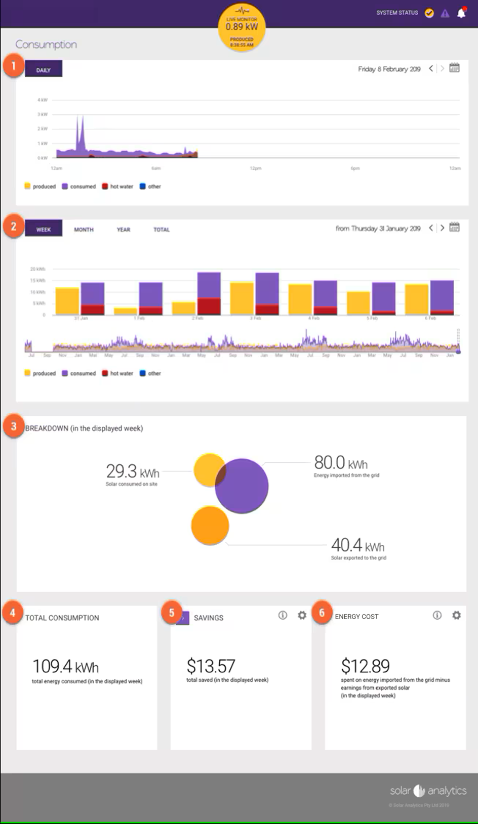
 Daily Production and Consumption
Section titled “ Daily Production and Consumption”Yellow curve: represents the solar production in 5 minute intervals.
**Purple curve:**represents the energy consumed from the Solar PV system and the energy imported from the grid in 5 minute intervals.
Overlap of yellow and purple curves: represent the produced energy consumed on site.
< PRO TIP >
If your import tariff is greater than your feed-in tariff, it is in your best interest to consume as much solar energy on site as possible during production hours to maximise your savings. In other words, increase the overlap of your yellow and purple curves.
The production and consumption data for a specific date can be selected from  and
and  icons.
mceclip0.png
Section titled “mceclip0.png”Note:
You may have other circuits monitored such as hot water represented by the red curve and other represented by the blue curve in the above example.
If you are interested in the consumption profile of a particular load, you can click on each of the icons to temporarily remove the load from the graph. For example, if you are interested in monitoring the Air Conditioner circuit only, you need to ‘switch-off’ the Produced, Consumed, Kitchen, Laundry, Office, and Other that the graph is only showing the consumption profile of the Hot Water. Please refer to the image below.
mceclip1.png
Section titled “mceclip1.png” Total Energy Daily Production and Consumption
Section titled “ Total Energy Daily Production and Consumption”Produced: total energy produced from your solar system in kWh per day.
Consumed: total energy consumed on site in kWh per day (i.e. energy imported from grid + solar consumed on site). In the below example, data is shown on a weekly basis. You can click on the ‘MONTH’, ‘YEAR’ or ‘TOTAL’ buttons to change this.
Consumption - Total Energy Daily Production and Consumption.png
Section titled “Consumption - Total Energy Daily Production and Consumption.png”A specific date can be selected from and icons.
Note:
To hide a circuit click on the corresponding coloured icon. For example to hide total energy produced, click on the
icon.
 Energy Breakdown
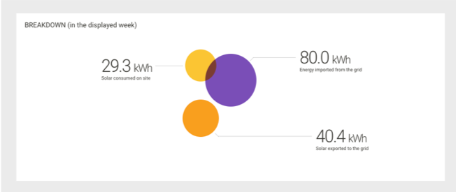
Section titled “ Energy Breakdown”In this section, you can view the energy breakdown in kWh in the selected date range for:
- Solar consumed on site
- Energy imported from the grid
- Solar exported to the grid
Date range can be selected by clicking onto the icon located in .
< PRO TIP >
If your import tariff is greater than your feed-in tariff, the best case scenario is for the graph to be mostly yellow, followed by orange with as little purple as possible. This would mean you are getting the best value for your solar during this time period.
 Total Consumption
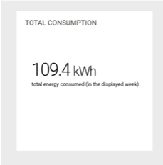
Section titled “ Total Consumption”Total consumption is the total energy consumed on site in kWh (i.e. energy import from grid + solar consumed on site) in the selected date range.
 Savings
Section titled “ Savings”Savings is the total amount saved in $ in the selected date range .
Your savings is calculated by:
Savings = ( kWh consumed on site x your import tariff ) + ( kWh exported x the export tariff )
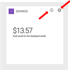
For more information about savings click on the
icon or visit our savings page.
You can update your import and export tariffs by clicking on the
icon in the Savings box.
 Energy Cost
Section titled “ Energy Cost”Energy Cost in $ is displayed in the selected date range .
Your Energy Cost is calculated by:
Energy Cost = ( kWh imported from the grid xyour import tariff ) - ( kWh exported to the grid x your export tariff )
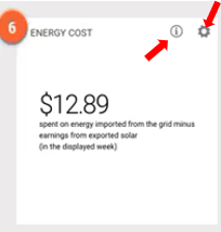
For more information about how Energy Cost is calculated click on the
You can update your import and export tariffs by clicking on the
FAQ:
What is the function for the above production and consumption graphs?
This function is very popular for:
- Ensuring that you are billed and credited fairly by the electricity retailer.
- A better understanding of how your energy consumption. Have you been importing too much energy from the grid? Have you been exporting too much energy to the grid?
- A bill shock prevention!
Keep track of how much energy you are producing, consuming, and selling back to the grid allows you to have a plan to optimise your consumption pattern. Even better, it allows you to prevent an expensive electricity bill by consuming more from your Solar PV system when possible.
Higher resolution data for Solar Generation and Consumption data
To gain the access to download your 5-minute resolution data, simply click ‘Contact Us’ button below and quoted the following:
I would like to have the access to download the 5-minute resolution dataAfter receiving this request, our Support Team will increase your access level that you are able to access the ‘Data Download’ page.
https://my.solaranalytics.com/au/fleet/data-download/
Please select either ‘Detailed Site Data’ or ‘Max Site Data’ to get the 5-minute resolution data.
More can be read about the Data Download on the link below.
https://solaranalytics.atlassian.net/wiki/spaces/SUPPORTKB/pages/5072191534